

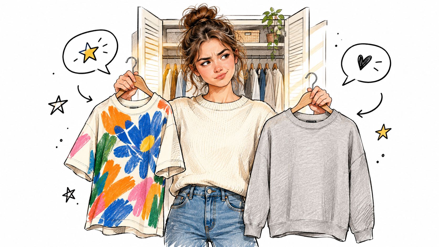
You're standing in front of your closet with a choice that feels small but never is. The loud graphic tee has personality. The plain crew is easier. One feels like a statement, the other feels safe.
That tension sits at the center of modern streetwear. A graphic tee can carry an outfit by itself, but it also has to work with real life. You still need it to look right with cargos on Saturday, under a jacket on Monday, and after enough washes that the print doesn't turn tired before you do.
The trick isn't choosing between bold and quiet as if one is always better. It's learning how to read the tee itself. Fabric weight, wash treatment, silhouette, and print method often decide whether a shirt becomes a favorite or just a photo-day piece.
Table of Contents
- Why Graphic Tees Still Define Streetwear
- The Anatomy of a Streetwear Graphic Tee
- Maximalist Prints Versus Minimalist Basics
- Building Outfits Around Bold Graphics
- Print Method and How Long Graphics Actually Last
- Caring for Printed Cotton Without Ruining It
- Buying With Ethics and Brand Intent in Mind
- Key Takeaways and Common Questions
Why Graphic Tees Still Define Streetwear
A graphic tee usually wins the closet debate because it says something fast. Before sneakers, before outerwear, before accessories, the shirt at chest level tells people what lane you're in. It can nod to skate culture, music, DIY art, faith, humor, or just a certain kind of restraint.
That role didn't appear overnight. Decorated T-shirts only became widely practical after WWII, scalable graphic printing arrived in the early 1960s, and by the 1970s graphic tees had become a defining part of fashion worldwide. Many histories point to screen printing plus Plastisol ink in 1959 as the key technical shift that made the modern graphic tee possible, as summarized in this market history of graphic designed T-shirts.
Why the tee became the canvas
A hoodie can signal a mood. A jacket can signal status. A tee does something more immediate. It sits in plain view, and it doesn't need layering to make its point.
That's why graphic tees streetwear never really disappeared. They moved from niche novelty to mainstream fashion, then kept evolving with every subculture that needed a wearable poster. Skate crews used tees like unofficial uniforms. Hip-hop turned the chest print into album-cover energy. DIY labels treated the shirt like a photocopied zine you could wear outside.
A good graphic tee works like a shortcut. People read it in a second, but the message can stay with them much longer.
Why they still matter now
The category is also too large to dismiss as a passing side trend. One market report projects the global graphic tees market rising from USD 9.31 million in 2026 to USD 18.03 million by 2035, and the same report estimates more than 3.2 billion graphic T-shirts were sold globally in 2024, with over 620 million categorized as streetwear. That report also lists the U.S. at 460 million units and China at 320 million for streetwear graphic tees in 2024, according to the graphic tees market report.
What keeps the tee relevant is simple. It can carry identity, but it also has to survive errands, transit, coffee spills, and a casual office that doesn't want a full runway look. That's where people get stuck. They know what graphic they like. They don't always know how to judge whether the tee itself is built for everyday wear.
The Anatomy of a Streetwear Graphic Tee
Streetwear gets easier when you reverse that and inspect the shirt the way you'd inspect sneakers. Start with shape, then fabric, then print.
Start with silhouette
Silhouette decides the mood before anyone notices the artwork. A boxy drop-shoulder tee feels current because the seam sits lower on the arm and the body falls straighter. That gives even a quiet chest print more presence.
A classic relaxed tee sits closer to the shoulder and usually reads more familiar, sometimes more vintage depending on sleeve length and collar shape. Same graphic, different frame.
If you like a modern oversized look, pay attention to three things:
- Shoulder line: A dropped seam widens the upper body visually.
- Hem behavior: A straighter hem supports cleaner stacking over trousers or cargos.
- Neck opening: A collar that holds shape keeps the tee from looking sloppy once the fit gets looser.
For a concrete example, the Heavyweight Vintage Washed Frayed T-Shirt is listed as unisex, 100% cotton, with a drop shoulder, round neck, and long, loose fit. Those details tell you it's built around shape as much as surface design.
Then read the fabric weight
Online shoppers often guess instead of judge. GSM tells you how substantial the cotton feels.
According to this guide to heavyweight cotton T-shirt fabric weights, industry references often place 160 to 200 GSM in the durability-and-comfort sweet spot, 220 to 260 GSM for premium oversized silhouettes, and 300 GSM for super-heavyweight pieces. A separate construction guide explains that heavier cotton improves drape, reduces cling, and gives graphics a more stable surface during printing and wear, which matters especially for boxy streetwear fits (fabric weight guide).
In plain language:
- 160 to 200 GSM feels easier for layering and warmer weather.
- 220 to 260 GSM starts to hold shape better.
- Above that, the tee behaves more like a structured garment than a basic undershirt.
Finally, check the print method
Print method changes both touch and aging.
A thick, slightly raised print often signals screen printing with plastisol. A softer print that feels more absorbed into the shirt may be water-based or DTG. None of those is automatically right or wrong. They just produce different results.
Practical rule: If the graphic is supposed to stay bold and opaque for a long time, construction and print method matter as much as the artwork.
That's why two product photos can look similar while the shirts behave very differently in use. A heavyweight blank with a soft-hand print can read muted and premium. A lighter tee with a thick print can look sharper on day one but feel less balanced once the fabric starts moving and twisting.
Maximalist Prints Versus Minimalist Basics
You pull on a loud tee on Saturday morning, then change before lunch because the print feels like too much for the rest of the day. The quieter tee you almost ignored ends up getting worn three times that week. That split explains a lot about how people use graphic tees.
Streetwear still has both lanes. One goes big with front-heavy artwork, loud color, bootleg references, and graphics that lead the whole outfit. The other stays controlled with faded cotton, small placements, tonal ink, and graphics that read more like a signature than a billboard.
Maximalist versus minimalist in practice
A maximalist tee behaves like a statement jacket. It sets the tone first, so everything around it has to support it. Large chest prints, busy back graphics, sharp contrast, and oversized text all sit in this camp.
A minimalist basic tee works more like a good pair of straight-leg denim. It still has identity, but it leaves room for the rest of the wardrobe. Small chest hits, restrained type, tonal line art, and low-contrast back prints usually fall here.
| Context | Maximalist Graphic Tee | Minimalist Basic Tee |
|---|---|---|
| Coffee meeting | Strong personality, but easier to overdress emotionally if the print is doing too much | Pairs easily with trousers, denim, or a light jacket |
| Weekend errands | Useful when you want one piece to carry the look | Easy repeat wear with less outfit planning |
| Casual evening plans | Reads well in photos if the rest of the outfit stays clean | Shifts across settings without feeling tied to one mood |
The part shoppers often miss is that volume is not only about artwork. Fabric weight, wash, and print method change how loud or quiet a tee feels on body.
A faded heavyweight tee with a small graphic can outperform a bright statement shirt because it fits into more real outfits. The heavier fabric holds shape. The wash softens contrast. The smaller print creates less friction with cargos, denim, overshirts, and casual trousers. That is where cost-per-wear usually tilts toward minimal designs.
A loud print on light cotton can still work well, especially if you want the shirt to do all the talking. But its use case is narrower. It acts like a spotlight piece. A washed, restrained graphic acts more like background music. You notice it, but you can live with it every day.
For readers comparing aesthetics more closely, this guide to minimalist T-shirt design explains why restraint often reads sharper, not weaker.
Maximalist tees still have a clear job. They create instant mood and carry outfits with very little help. Minimalist tees usually win on versatility because the fabric, wash, and print can keep the shirt interesting without forcing the whole outfit to revolve around the graphic.
Building Outfits Around Bold Graphics
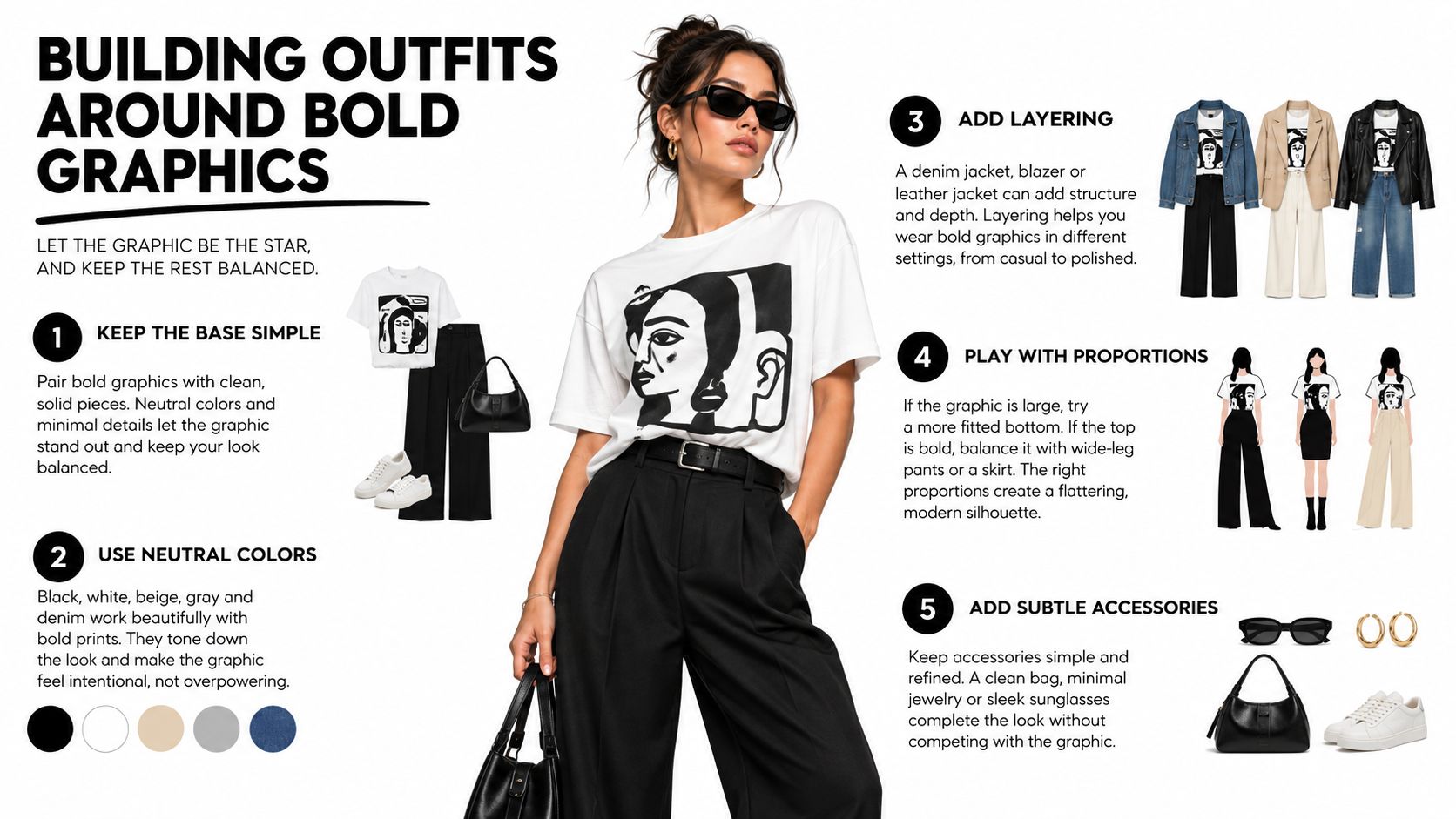
Bold graphics look best when the rest of the outfit behaves. That doesn't mean boring. It means every other piece should support the print instead of competing with it.
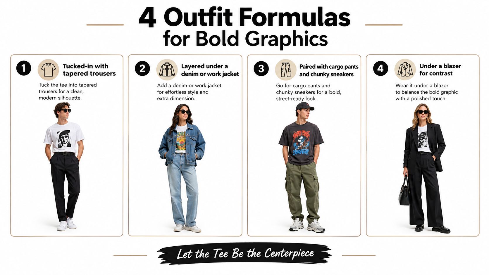
Formula one with cargos and grounded sneakers
Take a graphic tee with a large chest print. Pair it with straight-leg cargos in black, olive, stone, or washed charcoal. Finish with sneakers that have visual weight but not loud color blocking.
Why it works: cargos add utility shape while the muted leg color keeps attention on the shirt. If the tee runs long, a half-tuck can break up the length and stop the top from swallowing the waistline.
Formula two under a faded jacket
A loud print often calms down once it's framed by outerwear. Try a bold tee under a denim jacket or work jacket in a worn wash. Let only part of the artwork show.
A snow-washed shirt works especially well here because the faded surface softens the contrast before the graphic even enters the conversation. A tee like the Snow Washed Oversized Cotton T-Shirt from 99 Collection, listed in 100% cotton at 250 g/m² with a drop shoulder and loose fit, fits this formula because the wash already adds visual texture without needing extra colors.
Formula three with pleated trousers
This is the easiest way to make a graphic tee feel intentional instead of adolescent. Choose relaxed pleated trousers in black, taupe, deep navy, or grey. Fully tuck the tee if the print sits high enough, or leave it untucked if the hem falls clean and the trousers are fuller through the leg.
The tension is the whole point. The tee brings energy. The trouser brings order.
Let the graphic be the loudest thing in the outfit. Everything else should either frame it or quiet it.
Here's a quick visual reference before the last formula:
Formula four with technical outerwear
A bold tee under a shell, zip jacket, or lightweight technical layer gives you contrast in texture. The shirt feels expressive. The outerwear feels functional. Keep the palette narrow. Black, slate, washed green, and off-white do the job well.
A few fit checks help:
- If the tee is oversized, make sure the outer layer has enough room in the chest so the print doesn't bunch.
- If the hem is long, pair it with straighter pants so the outfit doesn't balloon at both top and bottom.
- If the print is busy, skip big logos on hats or bags.
People usually over-style bold tees. Most of the time, they don't need more accessories. They need cleaner support pieces.
Print Method and How Long Graphics Actually Last
This is the part buyers notice too late. A shirt can look great on arrival and disappoint once regular washing begins.
For streetwear graphics, screen printing is usually the safer bet when you want bold contrast and longer visual life. Properly cured screen prints are often reported to stay visually intact for 50+ wash cycles, while DTG often shows noticeable fading around 20 to 40 washes, depending on fabric, pretreatment, and care, according to this screen printing versus DTG durability breakdown.
What your hands and eyes will notice
Screen print ink usually forms a thicker film on the fabric surface. That's why it often feels more present to the touch. It also tends to keep opaque solids looking stronger over time.
DTG behaves differently. The ink penetrates the fibers more, so the print can feel softer at first. The tradeoff is that color density may fade faster as the pretreatment and repeated laundering wear down.
| Print Method | Feel on Fabric | After 20 Washes | After 50 Washes |
|---|---|---|---|
| Screen Print | Often thicker, more surface presence | Usually still holds bold contrast if properly cured | Commonly reported to remain visually intact beyond this point |
| DTG | Usually softer, more absorbed feel | May begin showing noticeable fading depending on fabric and care | Often loses more color density and visual impact |
Why fabric changes the outcome
A print doesn't live in isolation. It sits on cotton that stretches, twists, shrinks, and rubs against the world. Lighter shirts tend to move more, which can make cracking or distortion more visible. Heavier cotton gives the print a calmer platform.
That's why the question isn't just “screen print or DTG?” It's really “screen print or DTG on what kind of shirt, for how often, and with what care habits?”
If you plan to wear the tee constantly and want the graphic to stay dense and legible, choose durability first. If you want a softer, more lived-in fade, a less rigid print can still make sense.
Caring for Printed Cotton Without Ruining It
Most damage doesn't happen because someone wore the tee hard. It happens because laundry gets rushed. Heat is usually the problem.
A routine that actually sticks
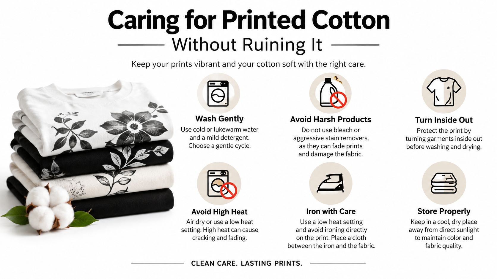
Turn the shirt inside out before washing. That simple move reduces direct friction on the printed surface.
Use a gentle cycle with cool or cold water. Avoid bleach. Skip harsh detergents if you can. If the label allows it, low heat is safer than high heat, but air drying is still the calmer option for both fabric and print.
For vintage-washed shirts, this guide to vintage wash T-shirts helps explain why washed surfaces and printed graphics both benefit from gentler care.
Small habits that prevent bigger damage
A few habits matter more than people expect:
- Reshape while damp: Smooth the body and sleeves before drying so the shirt keeps its intended proportions.
- Don't iron directly on print: If ironing is necessary, turn the shirt inside out or avoid the graphic area.
- Fold with care: Try not to crease sharply across a large print. Repeated fold lines can become stress points.
Rotation helps more than stain panic
If you wear one favorite graphic tee every week, that shirt takes all the wash cycles, all the body friction, and all the dryer risk. Rotation spreads the wear.
That matters most for your loudest pieces, because statement tees usually get the most repeat attention. The more visible the print, the more visible the damage once it starts.
Buying With Ethics and Brand Intent in Mind
Streetwear teaches people to hunt the drop. That habit isn't always useful once you start buying for a real wardrobe. A tee can be scarce and still be poorly made. It can be expensive and still give you very little life.
A better lens starts with stewardship. Buy the shirt you'll care for, wear often, and still want after the excitement passes. That usually shifts attention away from logo size and back toward construction, labor transparency, and whether the design has enough restraint to live with you for a while.
Read the label before the story
Brand storytelling can be beautiful. It can also distract from basic facts. Check the label and product page for:
- Fiber content: Cotton percentage tells you what you're wearing.
- Country of origin: Not a full ethics answer, but still part of the picture.
- Certifications: If a brand mentions standards such as GOTS or Fair Trade, it should be clear and specific rather than vague.
- Care guidance: A serious garment usually tells you how to keep it alive.
When a brand only says “eco” or “responsibly made” without any detail, treat that as incomplete information, not proof.
Use the three-wardrobe test
Ask three plain questions.
First, does the shirt work in your current closet? Second, will you still want it in six months when the novelty drops away? Third, does it seem built to survive repeated washing and wear without the fit or print collapsing?
Those questions are more useful than hype language because they force design, ethics, and endurance into the same frame.
Put construction before cachet
Recent reporting on streetwear keeps pointing back to heavyweight cotton, vintage wash, distressed finish, and broken-in feel. It also notes that T-shirts made up 22.4% of streetwear product share in 2025 and were forecast to grow at 6.9% CAGR through 2034, while observing that shoppers still get little explanation of why material and fit matter so much in real use (streetwear fashion trend report).
That gap matters because a shirt's value often comes from how well it lives, not how loudly it announces itself. A low-key tee with durable cotton and a wearable fit can outlast the emotional shelf life of a louder logo piece.
Key Takeaways and Common Questions
If you want better results with graphic tees streetwear, keep four filters in mind: fit, fabric, print, and care.
Fit decides whether the tee feels current or awkward. Fabric decides whether it drapes, clings, or holds shape. Print decides how the graphic looks and ages. Care decides how much of that original intention survives after real wear.
The big takeaway is simple. A well-cut heavyweight or mid-heavy tee with a quieter graphic often gives you more everyday mileage than a loud seasonal drop. Not because bold graphics are wrong, but because versatile shirts get worn more, styled more easily, and age with less friction.
Common questions
Can you shrink an oversized graphic tee safely?
Only carefully. Heat can affect both cotton and the print, so aggressive hot washing or high-heat drying may warp the graphic. A gentler approach is to wash according to the care label and accept the intended fit rather than forcing a big size change.
Do screen prints or DTG prints survive bleach?
Bleach is risky for both. It can damage the cotton and disturb the printed surface or color. If the label says avoid bleach, take that seriously.
What's the safest way to treat oil stains on printed cotton?
Spot-treat the stained area first and avoid scrubbing directly over the graphic. Wash inside out on a gentle cycle and skip high heat until the stain is gone, because heat can set it.
How do you authenticate limited streetwear drops?
Start with construction details, print clarity, label consistency, and seller transparency. If a listing leans on hype but avoids close-up details of stitching, tags, and print finish, slow down.
Buy the tee you'll still reach for when nobody else notices what release it came from.
That's usually the better wardrobe decision.
99 Collection offers unisex cotton staples with the kind of details that matter in this conversation, including vintage and snow-wash finishes, minimalist styling, and heavyweight options that fit naturally into everyday streetwear. If you want to apply the fit, fabric, and care ideas from this guide to real pieces, visit 99 Collection.