

You've chosen a blank tee, placed a small logo on the chest, and the mockup looks clean. Then the sample arrives. The fabric feels thin, the collar rolls after washing, the print disappears against the garment, and the oversized shape collapses instead of holding its line. That's the difference between a minimalist t-shirt design that looks good on screen and one that feels premium in real life.
Minimalism isn't the absence of decisions. It's strict control over every decision, from the message and typeface to the garment weight, wash treatment, neck construction, and final product photography. A restrained tee has nowhere to hide weak materials or careless spacing.
Table of Contents
- What Minimalist T Shirt Design Really Means Today
- Finding Your Core Concept Without Overdesigning
- Typography and Placement That Keep Designs Clean
- Color Palette Fabric Weight and Construction Choices
- Mockup Workflow and Product Page Setup That Converts
- Final Checklist and Next Steps for Your Minimalist Tee
What Minimalist T Shirt Design Really Means Today
The modern minimalist tee is more than a shirt with a tiny logo. It uses restraint, hierarchy, proportion, and negative space to make one idea easy to understand and easy to wear. A small chest mark can work, but only when its scale, placement, contrast, and relationship to the garment feel deliberate.
The T-shirt earned this role gradually. The modern short-sleeve, buttonless version emerged around 1900, while the U.S. Navy standardized white cotton crew-neck undershirts in 1913. The term “T-shirt” entered American English in the 1920s, and the plain white tee became a visible cultural symbol after Marlon Brando's 1951 appearance in A Streetcar Named Desire and James Dean's 1955 role in Rebel Without a Cause. By the 1960s, screen printing made the shirt a simple canvas for graphic expression, and the 1970s established it as a broadly unisex global staple. Read the history of the T-shirt.
That history explains why simple tees remain so powerful. Roughly 2 billion T-shirts are sold worldwide each year, and early white cotton versions succeeded because they were lightweight, inexpensive, and easy to wash, not because they carried complex graphics. The T-shirt's market and material history show how function created the foundation that design later refined.
Minimalism is a system, not a blank space
A useful minimalist tee has a focal point. It might be a short phrase, a symbolic mark, a tonal monogram, or a carefully drawn icon. Everything else supports that focal point or gets removed.
That approach suits faith-inspired brands, unisex labels, streetwear collections, and everyday basics because the garment can communicate identity without becoming costume-like. A restrained spiritual phrase, for example, can remain meaningful while fitting naturally into a wider wardrobe. For fit and styling considerations, the discussion of gender-neutral clothing for adults is a relevant reference point.
Before production, judge the whole system:
- Concept: Can someone describe the idea in one sentence?
- Typography: Does the type carry the mood without needing decoration?
- Placement: Does the mark sit naturally on different bodies and silhouettes?
- Color: Does the contrast survive the chosen wash?
- Garment: Does the fabric support the intended shape?
- Presentation: Does the product page show enough detail to build fit confidence?
A minimalist design succeeds when those parts feel like one decision rather than six disconnected choices.
Finding Your Core Concept Without Overdesigning
Start with one message, one symbol, or one emotional direction. Don't begin by opening a font library or collecting every reference image you like. Those actions create visual noise before you've decided what the shirt needs to say.
Write the concept in a sentence that includes the audience and feeling. “A quiet faith reminder for daily wear” is more useful than “a cool Christian streetwear tee.” “A clean mark for people who value movement and discipline” gives you a sharper filter than “minimal athletic branding.”
Use a one-idea filter
Build a small moodboard, but limit its job. Collect references for silhouette, texture, typography, and atmosphere, not a pile of finished graphics to imitate. If every reference has a different mood, remove the ones that don't reinforce your sentence.
Then choose a single focal point:
- Message first: Select a short phrase with enough meaning to stand alone.
- Symbol first: Reduce the idea to a shape that remains recognizable without explanation.
- Type first: Let the lettering become the identity, using spacing and proportion as the visual language.
- Texture first: Use a wash, embroidery, or tonal treatment to create interest while keeping the graphic quiet.
The editing stage matters more than the brainstorming stage. Remove secondary lines, extra icons, decorative borders, redundant dates, and unnecessary color changes. If the design needs several explanations, it probably contains more than one idea.
Practical rule: If the mark only becomes memorable when it's large, detailed, or surrounded by effects, the concept needs more editing.
Test recognition at the size people will see
Create a thumbnail version of the design and view it at phone size. Then place it on a full tee and step back. A symbol that looks refined at close range may become an indistinct speck from normal viewing distance, while a phrase may need more generous tracking to remain readable.
For a faith-inspired collection, avoid automatically using familiar religious symbols because they communicate quickly. A distinctive word arrangement, small reference, or custom geometric form can feel more personal and more wearable. The point isn't to hide the meaning. It's to give the wearer a reason to keep looking.
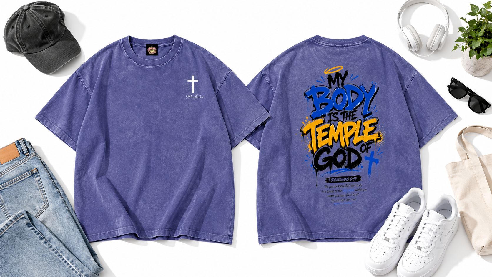
A product such as the Snow Washed Oversized Cotton T-Shirt illustrates how a restrained concept can work with a unisex, 100% cotton, 250 g/m² garment featuring a snow-wash finish, drop shoulder, round neck, and loose silhouette. Those product details should influence the design scale. A soft tonal mark may suit the washed surface better than a high-gloss, high-contrast graphic.
Typography and Placement That Keep Designs Clean
Typography becomes the design when the artwork is minimal. That means a typeface with poor proportions, cramped tracking, or an awkward line break can make the entire shirt look inexpensive.
Choose one primary type family first. A neutral sans serif creates a contemporary utility feel, while a serif can add editorial or heritage character. Hand-drawn lettering can work for a personal or devotional message, but it needs controlled irregularity. Mixing several unrelated typefaces usually creates the opposite of restraint.
Build hierarchy with small changes
Use weight, size, and spacing to create order before adding another font. A heavier first line paired with a lighter supporting line can establish hierarchy without visual clutter. Generous tracking helps short uppercase phrases breathe, but excessive spacing can make the words feel disconnected.
Line breaks deserve the same attention as the letters. Break after a complete thought or at a natural rhythmic point, not where the text reaches the edge of a design box. Test the phrase on the actual chest width because a line that looks balanced on a flat artboard can feel too wide once it follows the body.
Compare placements before choosing one
| Placement | Best For | Scale Tip |
|---|---|---|
| Left chest | Quiet branding, repeat wear, unisex basics | Keep the mark compact and give it generous breathing room |
| Center chest | A short phrase or single symbol with stronger presence | Use balanced margins so the design doesn't feel pasted on |
| Pocket area | Subtle identity and casual styling | Reduce detail and test legibility on textured or washed fabric |
| Back neck | Secondary branding or a discreet signature | Keep it small enough to support, not compete with, the front |
The left chest is versatile, but it can become generic if every release uses the same tiny logo. Center chest placement creates more recognition, though it demands better proportion. Pocket prints are approachable and easy to wear, but fine details can vanish at small scale. Back-neck marks are excellent for finishing a garment, yet they rarely carry the full identity by themselves.
Keep the upper placement close enough to the collar to feel intentional, while avoiding contact with the neckline seam. The infographic's practical checklist recommends keeping placement within 2 inches of the collar, using generous tracking, one typeface, and no more than two weights. Treat that as a starting framework, then test it against the actual blank and print method.
Screen printing can produce strong flat contrast, while embroidery adds texture and durability but forces you to simplify fine detail. Tonal embroidery may look refined on a clean cotton surface, but it can disappear on a heavily washed garment. Watch the design after the surface treatment, not just before it.
For a visual reference on how lettering and layout affect the final piece, review this minimalist typography placement video.
Color Palette Fabric Weight and Construction Choices
A minimal tee often uses fewer colors, which makes the garment itself part of the palette. Off-white, black, charcoal, stone, muted brown, washed navy, and subdued green can create a coherent range without making every item look identical. Washed finishes introduce their own variation, so sample the color after treatment instead of approving a perfectly flat digital swatch.
Contrast should serve the message. High contrast improves legibility, but pure white ink on a snow-washed surface may feel harsh. A softened cream, grey, or tonal print can preserve readability while matching the garment's lived-in character. Always check the design under natural light and indoor light because muted palettes can shift quickly between environments.
Match weight to silhouette
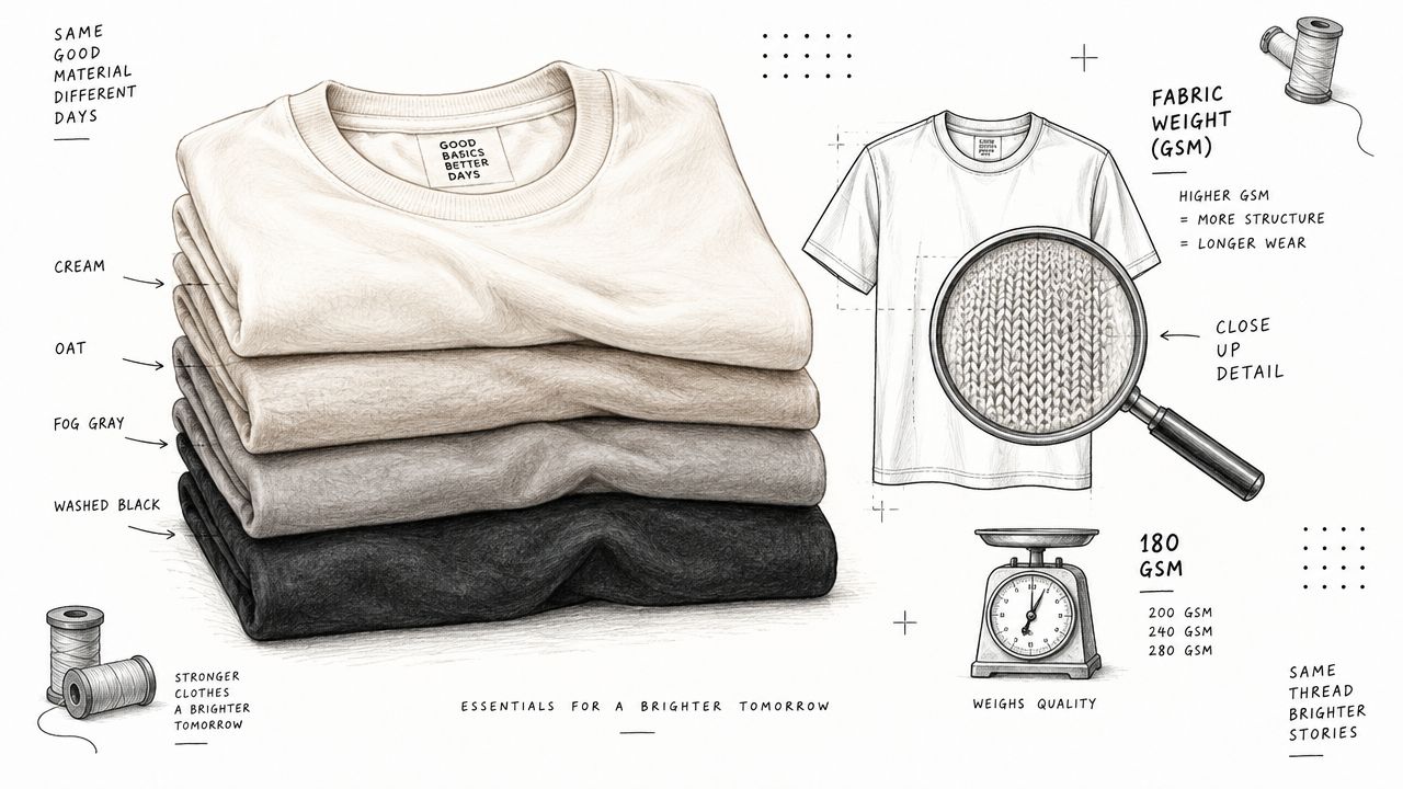
Fabric weight affects how the tee hangs, holds structure, and frames a small design. Premium cotton tees are commonly specified around 180 to 250 GSM when the goal is a more substantial hand feel, durability, and improved drape. This heavyweight cotton guide explains the essential sequence: choose GSM for the silhouette, test drape and recovery, then inspect the garment after washing and wearing.
A boxy or oversized cut usually needs enough body to hold its shape. If the jersey is too light, the shoulder may collapse, the hem can cling, and the shirt may look cheaper even when the artwork is excellent. A relaxed tee can tolerate more movement, but excessive structure can make it feel stiff rather than effortless.
For a deeper look at the garment side of the decision, see this guide to heavyweight cotton T-shirts.
Inspect the parts a graphic can't hide
The neck rib, shoulder seam, sleeve opening, and hem reveal quality quickly. A weak collar can curl after washing, while inconsistent topstitching makes a simple tee look unfinished. Wash treatments add character, but they also create variation in color and surface, so approve a physical sample rather than relying on a mockup.
Run a practical test:
- Wash according to the care instructions and measure the garment before and after.
- Check whether the collar recovers or stays stretched.
- Rub the surface lightly to look for early pilling.
- Inspect the print for cracking, fading, or loss of definition.
- Wear the tee under a jacket and on its own to judge how the silhouette behaves.
Minimalist design depends on texture, structure, and touch. If those qualities fail, adding more graphic detail won't rescue the product.
Mockup Workflow and Product Page Setup That Converts
A product page earns trust when the images answer the questions a mockup often hides. Show the actual garment color, print scale, shoulder line, sleeve length, and fabric fall on a body. For minimalist tees, also show how the wash, silhouette, and small placement choices read after wear. A polished image that conceals those details leaves buyers guessing.
Build the listing around fit confidence
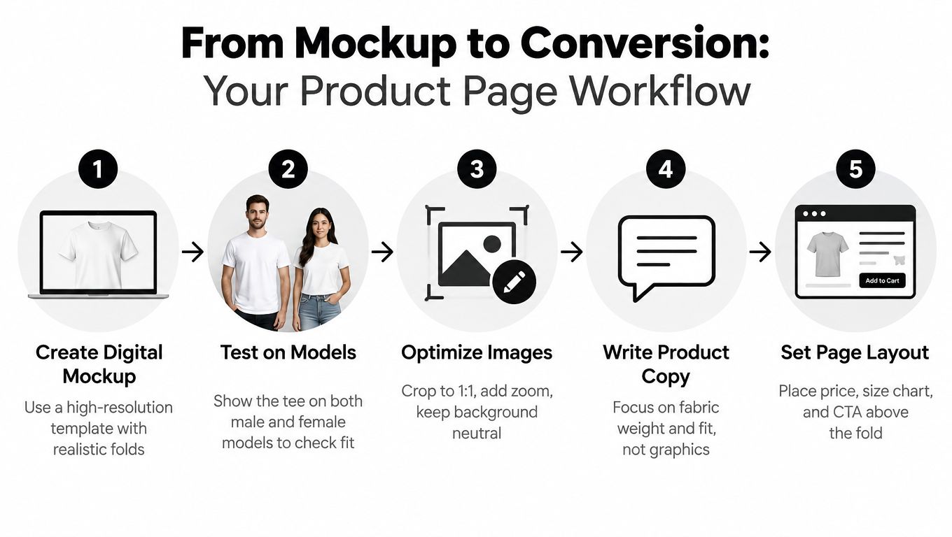
Create a high-resolution mockup using realistic folds and the artwork's actual dimensions. Match the sample's color, wash texture, shadows, and print distortion. Then compare it with a flat-lay and an on-body image. The flat lay makes placement and proportion easy to inspect, while the model image shows how the graphic moves across the chest and how the silhouette sits on a person.
Use this sequence:
- Create the digital mockup: Reproduce the sample's surface, color, folds, and print behavior instead of relying on a clean blank template.
- Test on models: Show different bodies and styling contexts so shoppers can judge the unisex fit, shoulder drop, and overall proportions.
- Optimize the images: Crop consistently, keep backgrounds calm, and include close views of the print, collar, fabric surface, and hem.
- Write product copy: Lead with fabric, construction, fit, wash, care, and measurements. A small logo does not need oversized marketing language.
- Arrange the page: Keep the price, size selection, size chart, and purchase action visible without unnecessary clicks.
Apparel ecommerce typically converts around 1.5% to 3% overall, while top-performing stores reach about 4.7% or higher, according to ConvertCart's fashion product-page guidance. Treat those figures as benchmarks, not promises. They show why fit information and checkout friction deserve the same attention as the artwork.
Check mobile before launch
Mobile conversion often runs 30% to 40% below desktop, so review the page on an actual phone rather than relying on a desktop preview. Check whether the first image communicates the silhouette, whether text remains readable, and whether the size selector works without awkward scrolling.
Tap every size option. Confirm that the selected state is obvious, open the size chart, return to the product page, zoom the garment, and complete checkout as a customer would. If shoppers cannot tell whether a loose cut is intentionally oversized or runs large, the listing needs clearer measurements and fit language.
For a practical reference when comparing relaxed everyday fits, see this unisex cotton T-shirt guide. Keep the description factual, and explain measurements in relation to a tee the customer already owns.
Final Checklist and Next Steps for Your Minimalist Tee
A strong minimalist tee should survive three tests: the idea test, the garment test, and the buying test. The idea must remain clear without extra decoration. The garment must retain its shape and feel after care. The product page must remove enough uncertainty for a shopper to choose confidently.
Use this pre-production checklist:
- Concept clarity: Reduce the design to one message, symbol, or visual thought.
- Recognition: View it at small scale and from normal wearing distance.
- Type control: Use one typeface where possible, deliberate tracking, and no more than two weights.
- Placement: Test left chest, center chest, pocket, and back-neck options on the actual pattern.
- Color behavior: Check contrast against the washed garment under different lighting.
- Fabric match: Choose the weight for the silhouette, not for the mockup.
- Construction: Inspect collar recovery, shoulder seams, hems, and stitching.
- Wash test: Review shrink behavior, pilling, surface feel, and print stability after care.
- Page clarity: Show the fit, measurements, fabric, care instructions, and detail images on mobile.
A unisex reference such as the Snow Washed Oversized Cotton T-Shirt uses 100% cotton at 250 g/m², with a drop shoulder, loose fit, round neck, slight stretch, and snow-wash finish. Those specifications demonstrate why the garment should guide the artwork. A small embroidery or compact chest mark may complement the texture, while an overly delicate print could lose definition against the washed surface.
Order a sample before committing to production. Photograph it after washing, wear it through ordinary routines, and ask someone unfamiliar with the concept what they notice first. If they remember the mood but not the mark, refine the placement or typography. If they notice the design but dislike the way the tee hangs, revise the fabric or silhouette instead.
The best minimalist t shirt design is not the one with the fewest visible elements. It's the one where every remaining element earns its place, and the shirt still feels considered after repeated wear.
99 Collection offers contemporary unisex staples with faith-informed, minimalist styling, including cotton T-shirts with snow-washed and vintage-washed treatments. Visit 99 Collection to explore garments that can serve as a considered foundation for your next understated tee design.